
Life on Earth
- frida@artyardbklyn.org

- Mar 10, 2023
- 10 min read
Updated: Mar 11, 2023
Monday in ART YARD Advanced Studio on zoom Artist Karla Prickett presented a session titled “Color Symbolism – Life on Earth” in which we explored our theme of Planet Earth by using color symbolism in composition to evoke a mood, emotion, or draw attention to the significance of a thought, issue, movement, and experience as related to improving the co-existence of life-forms on earth.
We enjoyed Karla’s well-researched power point which introduced us to symbolic color use of the colors red, black, blue, green and yellow through the work of many artists including: Titian, Wassily Kandinsky, Mark Rothko, Andy Warhol, Henri Matisse, Georgia O’Keeffe, Joan Miro, Pablo Picasso, Vincent Van Gogh, Matthew Wong, Carmen Herrera, Milton Avery, Bruce Nauman, Kerry James Marshall, Joan Witek, Paul Gauguin, Alex Katz and Jean-Michel Basquiat.

Karla recounts: “We looked at over 20 inspiring images exemplifying how color was used symbolically and emotionally by renowned historic and living artists. An interpretive vocabulary was presented for each color: red, blue, green, black and yellow.


For our artmaking, artists selected an issue related to our co-existence with all life forms on this planet earth to depict with symbolic color. When sharing our compositions, we shared how our selected color/s added to the interpretation and mood of our visual narratives.
Ed received many compliments on his piece, “Soldier of Fortune.” He selected (red) to symbolize “blood” and (black) for “death” to make a visual statement about contracted soldiers and the idiocy of the war in Ukraine.

Abby selected “feminine” (pink) paper for the background of her beautiful (black) line drawing symbolizing the power of women through marketing.

Sigrid’s landscape also included wonderful pen lines combined with shades of reds (urgency) and greens (nature) for hills and trees existing untouched by human events and technology.

Meridith’s painted cut paper sculpture featured a (green) hand representing “Earth” holding a vintage seltzer bottle re-filled with “water” (blue) and capped with a “precious” (gold) toned bottle top.

Kevin’s work in progress features a birds eye’s view of an “earthy” (green) tree with a sidewalk and figure translating how industrialization is sectioning off and diminishing nature.
Kevin explains his piece: “When thinking about our relationship with nature, I wanted to portray industrialization and its effect on nature. Not just buildings but also streets. It sections off plants in ways that prevent it from growing outward, and I wanted to use the colors red and purple to showcase that in the street and sidewalk. What is in green is a tree that a person is sitting under, enjoying his time and being one with nature in the moment"

My (Karla) work: “The Importance of Truth in Dialogue,“ places a group of figure/pedestal elements circling a globe on a (red) background symbolizing the “importance” of constructive dialogue in addressing the issues that affect us all. (blue) symbolizes “truth” and “order.”

Karla sums up saying: "I find symbolism and metaphor a significant part of my creative process. It was fun and challenging creating and sharing this lesson. The resulting works are wonderful and thoughtful.”
Dennis reports: On Tuesday at our partnership school The East New York High School of Arts and Civics, students worked with Teaching Artist Fatima Traore to complete their portraits celebrating Black History Month. There are pieces still in process as some students joined our group later in that last cycle - but they're all working diligently to finish.


Portraits in progress (use arrows to scroll)

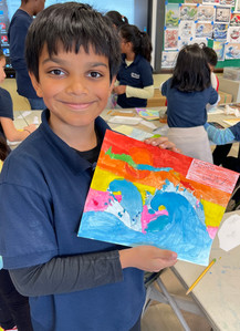
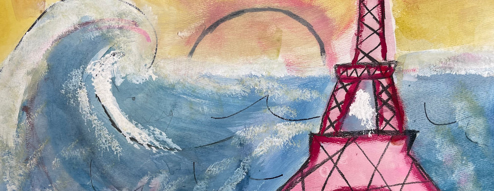
On Thursday, at Arts and Civics, The Great Wave travelled from the shores of Jersey City to East New York (ok - that's a figure of speech - are there even shores nearby? YES, I think so - Jamaica Bay and the Hudson River). Fatima and Dennis upcycled their Great Wave lesson to fit the skills of high schoolers and showed a power-point presentation on Hokusai's The Great Wave, woodblock prints, and images of variations on the theme of The Great Wave (mostly for inspiration).

Students responded well to the demonstration and started brainstorming - and drawing. Rah-nee drafted an anime type warrior seemingly fighting a wave (we'll need to get Rah-nee's complete description during the next critique) and Inez, an admitted horror movie fan, is going to depict a monstrous wave appearing before an unsuspecting person preparing to take a bath. Her clawfoot tub sketch is terrific and as Inez is sort of our in-class gold leaf application expert, I suspect those claw feet will be gold.


On Wednesday, Dennis had a zoom meeting and an on-site visit with several members of the administrative staff (including the principal) at PS 17 in Jersey City, The Joseph Brensinger Elementary School.
We are still in planning mode and have been asked to participate in the school's upcoming production of The Lion King (scheduled for mid June) by designing (and possibly creating) masks and sets - which we are excited to do. Dennis is mapping out the days and discussing options with various teaching artists to develop lesson plans that relate to what the school's requests are - and has researched the works of Julie Taymor (the director, costume designer, mask/puppet co-designer, and additional lyric writer of the original Broadway production) for ideas:

More planning next week and we have a tentative start date for the following week. Stay tuned!
Thursday evening ART YARD Advanced Studio artists met in person at The New Museum to view Wangechi Mutu: Intertwined, a gorgeous major solo exhibition work exploring the legacies of colonialism, globalization, and African and diasporic cultural traditions from across the artists twenty-five-year career. We had so many conversational threads running between us, it was a really exciting trip! So much so we repaired around the corner for refreshments and more enthusiastic talk.


Visiting Wangechi Mutu: Intertwined at The New Museum (photos by Meridith McNeal)
Evelyn Beliveau writes about the evening: "On Thursday, March 9, a lively ART YARD cohort visited “Wangechi Mutu: Intertwined,” an exhibition of the work of Wangechi Mutu (b. 1972, Nairobi) on view now at the New Museum. Curated by Margot Norton (Allen and Lola Goldring Senior Curator) and Vivian Crockett (Curator), with Ian Wallace (Curatorial Assistant), the expansive exhibition spans all five floors of the museum and brings together works from decades of Mutu’s career, including standout works of sculpture and collage at monumental and intimate scales.

Currents of mystical power, along with violence and unease, run through the show, primarily located in the bodies of Black women and fantastical hybrid creatures. There’s a startling breath of life in many of the sculptural pieces, and the two sculptures in the Lobby Gallery hint at what’s to come upstairs. The first is a large-scale bronze piece depicting two humanoid figures seated in a canoe, their heads and limbs wrapped (or made of) vines and leafy forms. The boat is filled with the water that pours from one figure’s leafy hand (the practical pumping system is neatly disguised from viewers, who perceive a magically self-sustaining flow). The running water and slightly green-toned bronze suggest monumental sculptures and fountains in public spaces, and the vitality of real running water brings with it all the connotations of life, blood, sap, vernal pools, and more, along with the pleasant burble of a brook. In contrast, the second sculpture is hauntingly silent. It takes the shape of an upright figure that could be animal, plant, fungus, rock formation, or something in between. Its rootlike limbs, primarily reddish-soil-like in color and texture, are hung all over with small bells, which invite the viewer to imagine how the sculpture might sound in a strong breeze. With the whimsy and the sense of ancient spiritual power of a woodland sprite, the figure keeps its secrets and its pregnant potentials for sound and movement. Both these sculptures evoked in me a strong sense of a mythic story-space, even though I don’t know what the story is or how exactly the figures relate to one another. They are both alive and not-alive, caught in a moment between breaths—a sense that repeats itself throughout the show. Also suggested in the Lobby Gallery are the themes of strain or violence to be developed later, hinted at by the use of gray emergency blankets as a sculptural material (wrapping the walls and the base of the bell-covered sculpture with veiny folds). Less present in the Lobby Gallery, but appearing again and again throughout the floors above, are artifacts of contemporary womanhood—such as the red high-heeled shoes of a shrouded, supine bronze figure, or the repeated motifs of fishnet tights and lipstick-coated lips in many of the collage works—that flash startlingly into the midst of this mythic or fairytale time-space.
Upstairs, the works on paper are loaded with paint, glitter, and beads, mingling with precisely cropped photographic material: images of disembodied legs, bare breasts, lips, and jewels. These glimpses accumulate to form anxious, performative, powerful figures, festooned with tufts and tendrils, talons and spider-legs, or more high heels. The precision of the cut paper is juxtaposed with splatters and drips of red paint, spatters of dirt, and even swirling formations of hair. Each collage is an intense juxtaposition of the sexy, the beautiful, and the beautified with the earthy, messy, bodily nature of human and animal forms. Again and again, surfaces are built up to a dizzying complexity and denseness, but also split open to reveal the red and beating heart within.

As potent as the works on paper are, I was most drawn to the sculptures—both the bronzes and the reddish clay or paper-pulp figures. The smooth, gleaming surfaces of the monumental bronzes (some glossy black, others with a patina gold or greenish in color) provide a contrast to the densely built-up surfaces of the works on paper. These elegant bronzes, some with the additional element of subtly bubbling water, include a figure riding a crocodile (or fused with it), a mermaid, a larger-than-life figure with a large, mirrored lip plate, large woven baskets filled with enormous braids or snake’s coils, and a pair of severed heads lying on a mirrored surface that throws a glistening reflection on the wall. These heads, and other appearances of truncated limbs or heads, suggest a space between “dead” and “never-dying”—bodies endowed with the weight and permanence of bronze and of myth, even as they show signs of discomfort or violence. On another floor, amid a congregation of multimedia sculptures studded with shells, horns, hair, beads, pottery fragments, fabric, and wood, I found myself walking along the lengthy body of a snakelike sculpture with an engorged belly and wondering whether this creature might be satisfied or sick. The humanoid, blue ceramic head rests on a lacy pillow, surrounded by small bottles and craned at an angle from the long tube of black snakeskin-patterned fabric that forms its body. As I perceived in other sculptures, this one seethes with the potential for movement—there is a sense that it lies dormant, and may seek to feed again. Like the bell-adorned being in the Lobby Gallery, this piece brought to mind spirits of the natural world, whose innate, benevolent power is threatened, but who still have the potential to heal.

I believe the exhibition is successful in its aim to “[grapple] with contemporary realities, while proffering new models for a radically changed future informed by feminism, Afrofuturism, and interspecies symbiosis.” I was swept into the world of these somehow both primordial and futuristic beings, fraught with mourning and discomfort but also empowerment and hope."
Putting finishing touches to their works on variations of The Great Wave, students at ART YARD Art Matters at PS 6, our partnership school in Jersey City, painted carefully, controlled the amount of water needed to apply paint, and used various techniques when drawing with colored pencils.

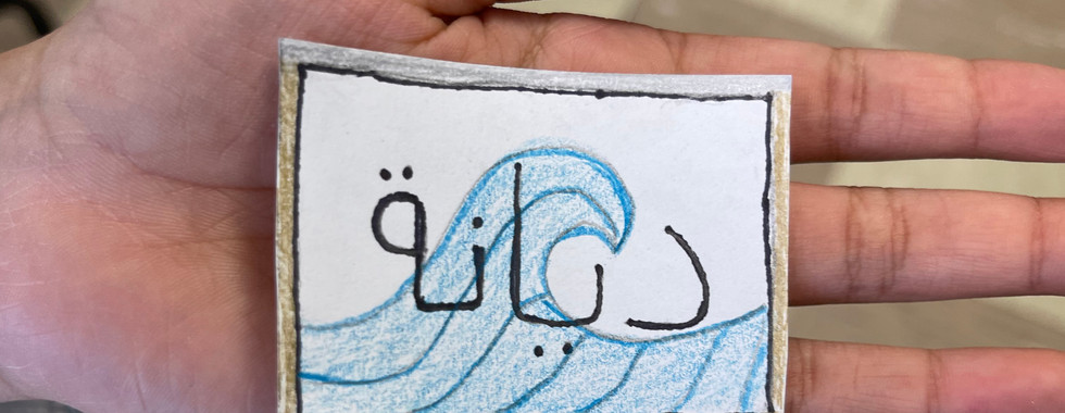
Dennis, Fatima, and Sarah guided students through one final segment of the lesson. Their signatures - in Japanese - using a modern version of the Japanese Katakana (there are 3 different alphabets in the Japanese language - and then ancient and modern versions - and most are phonetic and not actual A B C letters as we use) in vertical form. Sarah had an excellent idea to have students create stencils or blocks from foam and apply ink to add to the paintings - but, sadly, time is limited and it would have taken the entire period to complete. So - we opted for students following a Japanese lettering guide (and …. Fatima to the rescue! - she used a Google translator on the smart board to quicken the process) and used a tiny brush or ultra fine Sharpie to sign their works. The option of using the Braille alphabet (with Dennis' input) and/or Arabic lettering (with Sarah's supervision!) offered interesting variations - but most students chose for the Japanese letters although a few did all three. Sarah worked with some students using bamboo Sumi brushes to achieve quite an authentic Japanese style.


Dyanah created her name label with an image of the wave - almost looking like a postage stamp. Some students selected to sign directly on to their works while others signed on a thin rectangular piece of stock paper and applied it with glue. In every case, students practiced on scrap paper before signing their original work.


In each of our 3 classes, we assigned one student to create the folder for all the work - labeled with their classroom number - and he or she collected those works that were dry. At critique time, he or she laid out the work on 2 combined tables and then collected them all again at the end of the class. This saved us a lot of time - all we had to do was wait for the ones which were still wet to dry - then put them away in the folder for exhibition. It's great to have an enthusiastic and cooperative student.


Please use the arrows to scroll through the beautiful student artwork!
Critiques were energized by students seeing all the works at one time - and compliments were thoughtful and sharp.


Other Art News
ART YARD Artists have been busy in our studios! Delphine has been making new vibrant drawings depicting her signature articulated hands, eyes and mouths.


Delphine Levenson, untitled drawings, alcohol markers and colored pencil (in progress)
Vera shares her newest print, a self-portrait coin to add to her series on money.: "Representing my quarter century is a monoprint of ceramic quarter. Parodying the quarter, I changed the “in God we trust” to “in Vee we trust” and changed the year to my birth year. This work comes from thinking around money and exchanged for labor and time. For the majority of our early quarter century, in the US at least, children don’t work. As we get older, we transition into a time for making money, for selling time, and producing in the system of capitalism.

Evelyn shares a new painting that grew out of her sketches from the "Brave" lesson at 180 Franklin last Summer Session


Evelyn Beliveau, Brave: Spine Surgery (drawing), 2022 & (painting) 2023
My friend William brought me a plate I gave him years ago, an excellent subject for a new painting in my Magical Things From Recovery series.

Do you remember the oyster project we did in Advanced Studio back in September?!
With thoughts of oysters in mind I thought you would enjoy “The Dorises - Oystercraft from silicon to saltwater.” a project by my friend Marina Zurkow in collaboration with Ira Greenberg—in Chain Reaction, an exhibition curated by Christiane Paul on Feral File and on oystercraftreef.com.

💚


Recognized James Baldwin right away!
The Mutu show looks amazing! Wish I could have gone with you.
love how everyone "caught a wave" in their very personal ways - great job, everyone!!