Looking very snazzy!
- frida@artyardbklyn.org

- May 10, 2024
- 7 min read
We began the week in AYB Advanced Studio on zoom with Jordan Hendrickson who was back with another animation inspired session. Initially scheduled as part-two of his animation session back in February we were thwarted by a snow day, it was great to re-visit the topic!

Jordan shared an excellent power point clearly explaining animation techniques and concepts. He also shared new drawings, recent animation, and a trailer for his film Janke, a story about his mother and her friends.
To hammer home the ideas taught in the session Jordan made a Jeopardy game which we played to great hilarity. Dom, Leah and Seyi, all new ART YARD Artists, proved to be very good at this game, as did Marilyn!

Our winning team got to pick an element of our drawing prompt and chose to have Jordan give us a scenario for our six panel story board: The First Day of Kindergarten (for the little girl version of his mother Leislene.)

Jordan pointed out that Vee did not start with an establishing shot but we all "got it"!


With ART YARD Artist Evelyn Beliveau we concluded our ART YARD Advanced Studio in person lesson cycle on portraiture.

Evelyn sums the session up: “Keeping the format the same (head and shoulders on an 11” x 14” surface) across the three weeks, we’ve moved from pencil drawings to monochrome brown acrylic paintings to this week’s vibrant limited palettes. We were thrilled to welcome several new-to-AYB participants to the lesson. Everyone got settled in over bowls of Meridith’s wonderful pasta.
AYB Artists painting in acrylic from our live model Sailor
To start, we recapped some of the main takeaways from the first two weeks of this cycle, such as rules of thumb for mapping the facial features on the head (week 1) and distinguishing shapes of light and shadow based on upward-facing and downward-facing planes of the face (week 2). To illustrate, I showed examples of live portraits I’ve made in years past, many of which also make use of the warm/cool contrast that we focused on during this lesson. We established red, orange, and yellow as “warm” colors and green, blue, and purple as “cool” colors.

Leni writes about her experience in this session: "I just want to start by saying thank-you and thanks to Evelyn for class this past Tuesday I got an amazing sense of genuine community right off the bat.
I joined in on the groups 3rd portrait class and everything was thoroughly explained and demonstrated and it made me feel comfortable and safe being part of an art class since college. We focused on using warm and cool colors to make a portrait of our model. It amazed me to see everyone’s version of them and the different colors everyone choose to use to depict the shadows and highlights that made up their face. I couldn’t be more grateful for this experience and hope I’d get the opportunity to do it again in the future."
Evelyn continues: "Then, our fantastic model, Sailor, took the stage. For this session, I asked each participant to choose a palette of only three colors, to provide a constraint within which to work. Of those three colors, I asked that at least one be warm and one cool, and at least one dark and one light in value. During my demonstration, I used viridian green (cool, dark), cadmium orange (warm, midtone), and cadmium yellow (warm, light). I demonstrated priming the surface with the midtone, making quick pencil marks to loosely indicate the top of the head, bottom of the chin, and the outer bounds of eyes, nose, and lips, then starting with the pure dark green to fill in the darkest shadows (found in the eyes, nostrils, and hair). From there, I suggested working through midtones mixed from the dark and middle colors, then adding highlights with the brightest color.

Participants chose a wonderful range of colors, as seen in the finished pieces. Some trend very warm, others very cool, and others feature a greater warm-cool contrast. The group was very focused during the 45 minutes of work time, and asked great questions, especially about adjusting to the 3/4 view that many had. Some grappled with the color combinations, figuring out how to achieve highlights without using white paint (or mixing white into one of their original colors at the very end). Everyone appreciated Sailor’s focus and intense expression while modeling.”

During critique, comments abounded comparing textures and color combinations between the works.
Ed pointed out that: “The heavy outlining and bold features found in the portraits by Chloe Kaas and Leni Silva recall the encaustic Fayum Mummy Portraits of Roman citizens buried in Egypt in the 1st century BC - 3rd century AD.”


Evelyn concludes: “Sailor mentioned that Liv’s piece felt like looking in the mirror, and Ed admired Taylor’s use of warm pink and cool brown. We were stunned that Taylor had never painted before and that Leah hadn’t painted in 10 years, as both made beautifully observed and sensitively colored paintings. All 16 pieces are invested with the artists’ individual hands, from the initial palette choices to the quality of the brushwork—ranging between washes and impastos, subtle modeling and emphatic outline. As we went around the circle for compliments, many heartfelt sentiments were expressed about the welcoming energy in the room, the lesson itself, and one another’s work. Of course, many thanks to Liv for making the social media post that brought AYB awareness to many newcomers, and to Meridith, who makes it all happen!”


Dennis reports in from Jersey City: “A whirlwind of serious art-making at ART YARD Art Matters at PS 17, The Joseph Brensinger Elementary School in Jersey City, this week. Teaching Artist Gia Gutierrez subbed for Evelyn's classes as well as overseeing the afterschool program - we accomplished a lot!

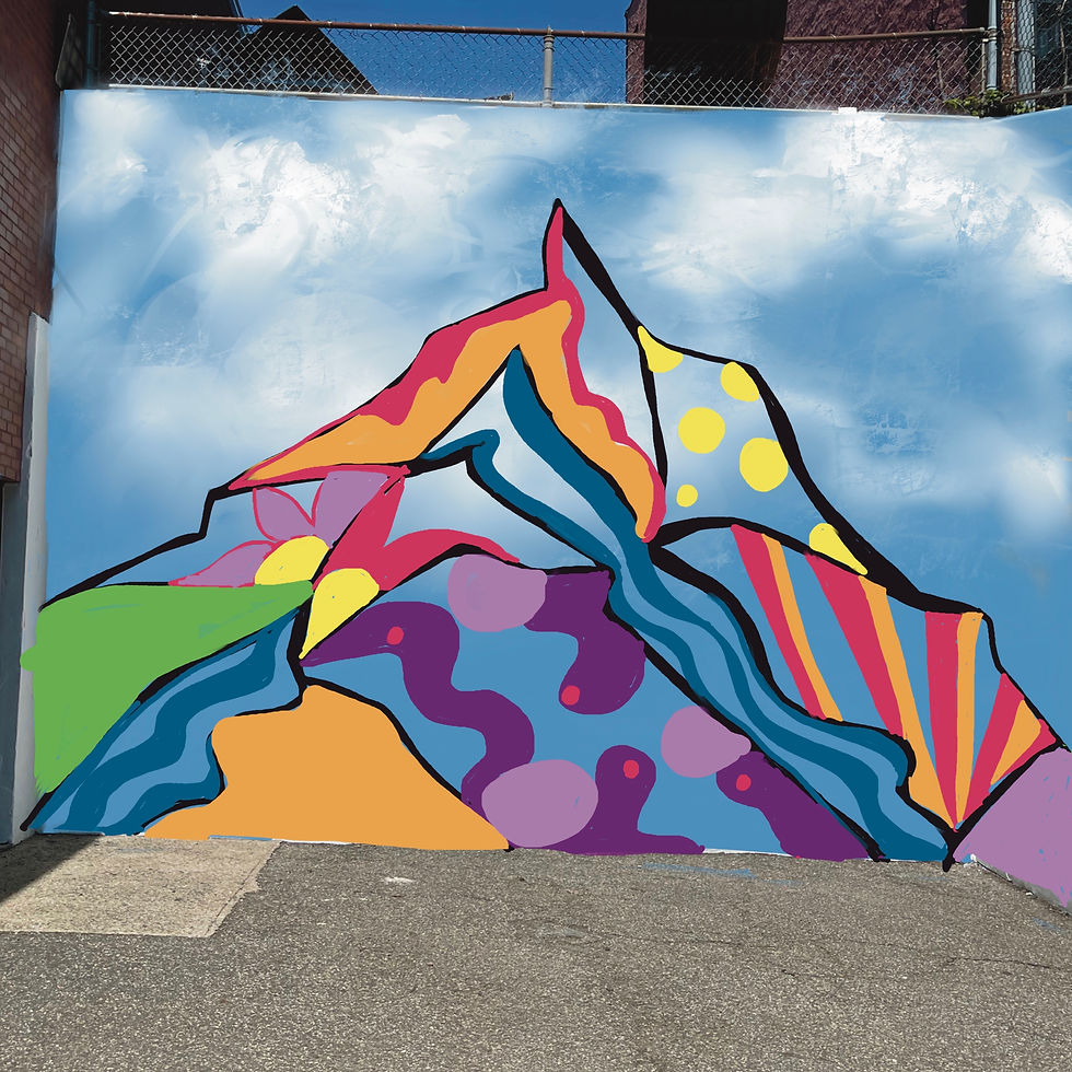
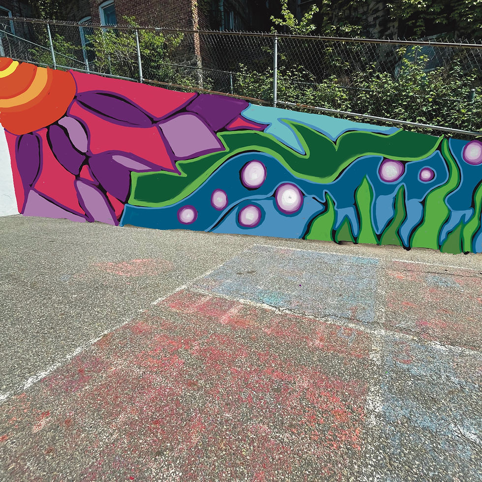
The after school group discussed the mural project details and Gia showed the group her draft for the mural design - a composite of the students' ideas and works over the past two weeks. Lots of smiles and compliments - but once we asked them to come up to another level and give us honest thoughts, a smart round of discussion followed and Gia and I took notes. The drafts were shown to Dr. Brower, the school's principal, too who loved them but also offered some suggestions for change. Perfect - this is what we like to hear!


As for their weekly lesson/project, Gia took them on a completely different route and showed images of collage works and discussed texture, composition, and layering. Students chose bits of colored paper or images from magazines and started to arrange and paste - many looked up in a bit of surprised when I announced that they would need to explain their works at the end of the class (reason for placement, overall theme/genre, color choices, text meanings, etc.) but they moved forward with confidence and were happy to explain their pieces.


Earlier in the day, First graders started attaching their cut out flowers onto 12 x 12 squares of brightly colored card stock in the style of Andy Warhol's flower compositions - with great success (and smiles).
Fourth graders started painting their fruits (modeled after Warhol's banana works, and his 'space fruit' pieces) using watercolors. Gia demonstrated various techniques and challenged students to achieve a 'brushless' look - needless to say, they mastered that challenge. Students loved creating these which allowed them the license to use any pop-art color not necessarily related to the natural fruit colors (lavender watermelon seeds!).
Following Gia's watercolor demonstrations too - sixth and seventh graders continued with their 'ordinary/mass market objects' paintings in the style of Warhol's soup cans, Coca Cola bottles, and Brillo boxes.


A successful day at PS 17 with lots more to follow.”
This week at ART YARD Art Matters at PS 6, we concluded a lesson cycle inspired by Realist painters of the 19th century.

Teaching Artist Evelyn Beliveau summarizes: “Dennis, Evelyn O., and I were kept very busy with our energetic P.S. 6 classes of 2nd, 3rd, and 4th graders!
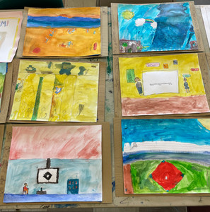
In weeks 1 and 2, students drew and began to paint images drawn from their everyday life, featuring teachers, friends, pizza deliverers, and more. We worked on watercolor painting skills to achieve precise coloring and blending with slow, gentle brushstrokes and just the right amount of water, and the ever-important step of washing the brush between colors. When we began today, students were in very different places in the process—some were nearly done painting, while others had just begun to add color. Everyone started off by finishing their paintings, and as students reached this point, we added one more step to get their work ready for presentation in the gallery—hand-drawn trompe l’oeil picture frames!
Students looked at a sampling of 19th-century frames with lots of decorative detail for inspiration. Then, using toned tan drawing paper, pencils, and fine-tip pens, they traced their paintings and created their own unique designs for frames. These included faux-3D accents, stripes, swirls, flowers, and other imagery. Once the “frames” were ready, the students mounted their paintings using tape. Along the way, they learned about tearing and rolling tape and placing it so that the painting lies flat but the tape itself remains hidden. The final “framed” paintings looked very snazzy!

Dennis, Evelyn O., and I went down to the gallery to consider how all the student work from this year can be curated into a meaningful exhibition on this year’s AYB theme, DO SOMETHING. We’re very excited to recognize students’ creative efforts at the end-of-year exhibition opening."
Other Art News
AYB Teaching Artist Rachael Wren’s solo exhibition The Long Way Home in now up at Rick Wester Fine Arts, 526 West 26th Street, suite 417, in Chelsea. Rachael writes: “This exhibition is about things I inherited, things I cast off, things I've come back to, and things I want to pass on.” The exhibition is on view through June 29, 2024.

Radiant: The Life and Line of Keith Haring by Brad Gooch (Harper, March 2024) is a deep look at Haring from childhood in Kutztown, PA, to his meteoric assent to one of the most emblematic artists of the 1980’s, his early death from AIDS in 1990, and finally to his legacy, which endures today. Haring’s friends and collaborators, his regular haunts, quirky studios, as well as his artistic methods are all described with superb detail and care. A must read book for all Keith Haring fans, and those who are interested in the NYC artworld of the 1980's!

REMINDER: Advanced Studio Sign Up is available on our homepage on Sunday 5-6pm!

💗♥️💙💛💚🩵


Comments