
The Invisible Line Between Work & Art
- frida@artyardbklyn.org

- Apr 8, 2022
- 10 min read
ART YARD Advanced Studio on Zoom began the week considering The Invisible Line Between Work & Art : Finding the Artistry in Day to Day Activity in a fantastic session with Teaching Artist Maraya Lopez.
Maraya summarizes: “When does art stop being work and work stop being art? This conundrum was the basis for my lesson. There is an invisible line that exists between creating and what we know as work.
Is there an artistry in day to day activity? I believe that the act of creating is similar to the artistry that exists in day to day activity, such as brushing your teeth or doing laundry. If one is consciously present in day to day activity as when making art, the spirit transcends the earthy realm into the unknown.
I started the lesson with questions to the class and then we had discussion in small groups.
1. Do you consider art making to be work?
2. Is going to school work?
3. Does labor have to be involved to produce an artwork?
4. Is there an artistry in day to day activities, such as gardening and cooking?
Work samples as inspiration included art made by NYC based artist Whitney Oldenburg, Cambodian sculptor Sopheap Pich and Van Gogh.
Sopheap Pich: A Room Click to watch a video about his work:

Whitney Oldenburg writes about their work: “The visual indexes of pilling, building, cutting, puncturing, and destroying, suggests a highly psychological and emotional labor; one that embraces phobia and anxiety as a part of existence.”


I know this lesson was challenging in terms of the somewhat heavy philosophical notion about art and work. However, the students managed to find the light and airy within the weight. I was very pleased with the various responses!!
Alison’s depiction of her father’s hand alluded to labor and was accompanied by a touching story about his role in her life and a poem.


Alison Guinet, Invisible Line Between Work & Art and poem by rupi kuar
Zeke’s sci-fi looking machine spoke to capitalist society and a humanesque labor contraption. Which Jacob compared in critique to the illustrations in Bini Adamczak’s book Communism For Children.


Assata’s quotidian working life turned into a lyrical composition of color, rhythm and shape with an occasional bird.

Nayarite’s piece in tones of blues and greens was based on sleeping and mentioned that she believed sleep to be work.”

My own (Maraya) piece was inspired by filmmaker Yasujiro Ozu’s film, Floating Weeds and his use of the color green.
Floating weeds, drifting down the leisurely river of our lives,” has long been a favored metaphor in Japanese prose and poetry. This plant, the ukigusa (duckweed in English), floating aimlessly, carried by stronger currents, is seen as emblematic of our own journey.
Maraya Lopez, Invisible Line Between Work & Art
Meridith’s piece was playfully based on her mousepad that has a Van Gogh image printed on it. I thought her use of the circle was emblematic of balance and a metaphor for the balance of life and work.”

Vera’s video begins with the pattern of her uniform from her weekend job as a clown!
Vera Tineo, Invisible Line Between Work & Art
Karla writes: Is art making work? Without further question – YES. After three rounds of re-“working” with my selected materials: Cut paper from recycled photo album pages, graph paper and garage sale log on spiral notebook. After Maraya’s great and thought provoking lesson I Zoomed in Tuesday with Ed’s still life challenges of intentional perspective and translations in local colors. His color addition to Monday’s drawing provided a perfect example! Great lessons!! Thank you!!!

Jacob had all of us roaring over his description of proctoring tests and an outfit that resembled a potato sack.

Robin used multiple views to depict her studio desk.

Marilyn’s mixed media piece looks at the work of gardening.

Delphine painted the stress of the work of a student.

Pat explores the balancing act of work.

And Ed draws the tools of the construction trade:

This week ART YARD Advance Studio usually in-person took place on Zoom (due to a covid exposure in the group). We began the second session with Teaching Artist Ed Rath with a quick review of last week’s question, “What is the Picture Plane?”
Ed reports: “Building on our work with contour line drawing, we segued into a discussion about how to translate a line drawing into a painting. For inspiration we looked at six works by Edward Hopper, including working drawings, and finished paintings which incorporate elements of those drawings. To create these works, Hopper started off drawing the scene from observation; later in the studio, he recomposed the imagery, integrating extreme geometric forms with high contrast color planes to give his mundane subject matter a feeling other-worldliness. This translates to most viewers as a feeling of alienation or isolation. These unique paintings open a portal into a totally Hopperesque world,


Edward Hopper, sketches and Morning Sun, 1952
From there began a discussion on the question, “What is Local Color?” To
address this query each participant set up a simple still life from which they made quick line drawings. Next, we added Local Color, that is, color derived from observation.
The works produced had an unexpected freshness.
Jacob, working from a hostel room in Chicago, used objects found in the room to set up hierarchical space, with a power strip at the top of the page functioning as the horizon line. His restrained color and faint shadows inform us that the local colors are bathed in warm light.

Likewise, Meridith’s still life objects, viewed from above, glow under the ambient light of the room they occupy. Included here is a small, battery powered table lamp which, as evening progressed, grew brighter, casting its orange color onto the surrounding objects. Borrowing a page from Karla’s lesson featuring the white line lithography of Eva Gilmore, Meridith utilized white outlines on some of her objects, adding to the ethereal quality of her imagery.
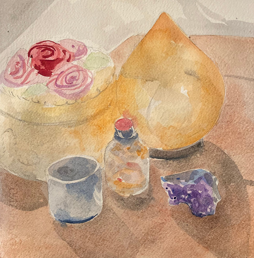
Utilizing a simple “Drop-off” horizon line, Evelyn’s well observed still life masterfully incorporated ellipses, rectangles, a truncated triangle, and a long tapered wedge to represent dishes, a flower pot, a jewelry box, and a paintbrush. The paintbrush - proverbial symbol of the artist’s hand, is repeated in her picture by its shadow, running below and parallel to it. This shadow literally underlines the importance of this potent symbol. Also notable: her subtle, muted color, resulting from local color immersed in atmospheric light, as perceived through the eye of the artist.

Like Meridith, Alison viewed her set-up from above. This view implies that the horizon line and subsequent vanishing point is somewhere above the top of the image. Her beautiful set-up incorporates high contrast colors with an interesting sequence of symbols: a red smiley heart emoji, a book, and a pair of glasses, resting on a sensuous dark green silk fabric. My interpretation: A self-portrait celebrating the artist’s love of life, art, and learning.


Alison Guinet, Local Color still life and painting.
Robin’s carefully observed drawing uses contour line exclusively to describe form in a convincing, matter of fact way. With the addition of local color, the picture comes alive, its shadows and accent colors lead the viewer through the space occupied by the objects depicted. Before she was able to finish the color work, her daughter plucked the candy bar from the array and ate it, a poignant reminder to all of us that, Life is short and Art is long.


Robin Grant, Still life drawing and Local Color.
Karla’s deceptively simple image is a marvelous example of deep, deep space. The table top on the foreground pushes the viewer away from the picture plane while the potted plant looks longingly out the window at the faraway mountains, sky and sun, the source of light and life. Karla executed her drawing in colored pencil which lends itself well to atmospheric color. The series of horizontal lines moving up the page takes the viewer further and further outside the picture plane, even as it reinforces the flatness of the geometry.

Who would have thought still life painting could be so exciting?
To save time, I recycled the still life drawing made yesterday in Maraya’s class. I set the objects up on the same table and tried to match the local colors in front of me. Right away I observed a lot more gray and brown than I remembered. Also, adding local color made my composition feel more static, as it calls attention to the fact that the circular saw blade is positioned near the dead center of the picture. This is something I will rectify in upcoming versions of the image.

Nayarit hit a home run with her picture. She established the illusion of deep space using a large, dark potted plant in the foreground, a row of faintly drawn plants in the middle ground, and a lighter, empty area outside the door frame, implying deep, deep space beyond, possibly the ocean or open sky. This plays off of the Hopper piece we looked at in the lesson, Rooms by the Sea. The gray middle ground feels light and airy, although it lacks strong color. This mimics how our eye sometimes perceives far-off form by its gray-value equivalent, rather than by hue.


Which leads us to our next lesson, in which we will compose a dynamic still life using only black, white and gray.”
We had a high-energy class ART YARD ART Matters at BNS after school session this week.
Teaching Artist Evelyn Beliveau relates: “Leaving some time for students to finish or work on their Surrealist-inspired eye collages, we began a new lesson. Inspired by the STAR installation by Art Yard teaching artists from this past year, we began by reading this quote from Oscar Wilde: "Your flowers are so lovely they have made me well again." Students discussed their ideas about what this means--the general consensus was that flowers are beautiful and make people happy.


Installing "Your flowers are so lovely they have made me well again" and Lily by Evelyn Beliveau
We set up each table with a vase of fresh flowers with many shapes, sizes, and colors. After talking about a new vocabulary word--gesture drawing--I demonstrated how to look carefully at the movement, or gesture, of a flower and draw it using quick strokes.


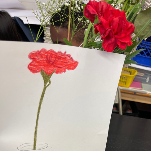


Rather than starting with pencil contours, as we did in the last project, we used color right out of the gate. Students practiced on small paper and then moved on to collaborative pieces with their table mates on larger paper, filling the pages with energetic and colorful drawings. Lucas worked carefully on the swirling petals of a red rose, Charlie added a pink background to her field of flowers, and Olivia drew the jar that the flowers were in with keen observation. Other students included grass or a horizon line, imagining their flowers in a natural setting.

We ended with a critique in which students noted different colors of flowers that appeared in their peers' work, as well as the effects of fast or slow shading.”
Dennis reports: “It was a 'griddy' kind of Friday at PS 6, our partnership school in Jersey City. Teaching Artist Evelyn Beliveau led students further into their lessons on grids, and grids within grids, and grids within those grids - you get the picture, right?
Each class used a different medium to add color to their piece of the big puzzle.
Van Gogh's "Starry Night" is taking great form by the use of Prismacolor pencils in various blues, greens, yellows, blacks, and some purples. They also blended to achieve their desired colors. Students learned that the actual "Starry Night" is practically in their own backyards - at MoMA on East 53rd Street. Students squealed with delight at the thought of traveling into NYC to see it. Evelyn showed the class a variation of "Starry Night" called "Stellar Night" by Mark Ulriksen which graced the cover of The New Yorker last week. Students compared and contrasted "Stellar Night" to "Starry Night" - finding mostly great comparisons in colors, design, and the variation of the word 'star'. Isabelle raised her hand and told us that the word for 'star' in Spanish is 'estrella' - very much like 'stellar'.


Stuart Davis' "Hot Still-Scape for Six Colors — 7th Avenue Style" is truly a class favorite. Working with brush tip and chisel tip markers, students were matching their finished pieces with each other's and/or compare them against the original. Since we opted not to use white markers (or paint or pencil) in the project, some students chose to use pale blues or light pink in the white spots while others just left the space (on the white paper) blank. Evelyn and I think this will create a very interesting contrast in the final piece. Evelyn told the class that Davis' piece hangs in the Museum of Fine Arts in Boston - more squeals! Substitute teacher Yamini Sanghavi stood in for an absent student and created a beautiful pieces with neat and bold lines.


Watercolor paint was the medium used in the last class of the day (chosen specifically due to clean up required for a watercolor class). Working on their large scale Georgia O'Keefe painting, students practiced color mixing before applying paint to their grid pieces and left them to dry during critique. While some worked very meticulously, others finished large spaces (using large brushes) rather quickly and started 2nd pieces.


Most mentioned that they found the drawing portion of their class more challenging than the pencil, marker, or paint portion. I wasn't expecting to hear that - but elementary school students are mostly very honest the question of "what did you find most challenging?".

Other Art News:
On Saturday evening, ART YARD Artists Marie Roberts, Alison Guinet and I participated in Observation/Transformation, a lively evening of life drawing and spontaneous tableaux vivants with improvised movement organized by Edward Monovich at FiveMyles. It was great fun to draw the eclectic performers and musicians!


I am pleased to have work included in POST TENEBRAS LUX at Union Gallery, Wagner College, April 7 – May 12, 2022
Post Tenebras Lux: Latin, “After darkness, light.”
Adjunct: adjective, “Associated, connected; subordinate, supplementary.”
The adjunct faculty in the Department of Visual Arts are far from “supplementary” as this collective exhibition of their artwork demonstrates. They are, to use a word widely employed during the pandemic, “essential.” But we are also aware that so-called “essential workers” are not always compensated to the extent that they deserve, and adjunct faculty are unfortunately no exception to this tendency, including at Wagner.
This exhibition celebrates a return to physical exhibitions in the Union Gallery with a celebration of adjunct art and film faculty’s creative contributions. Its title implies forward movement from the period of darkness within which we have lived for over two years. But it also directly attributes this progress to those who have given their energy so that we may all benefit from exposure to the creative process inside and outside the classroom.

NYC Art openings/events to attend this weekend:
Congratulations to ART YARD Board member Cecile Chong on her solo exhibition LORE opening tonight Friday April 8th 5-8pm at KATES-FERRI PROJECTS, 561 Grand Street, Manhattan

Sunday, April 10, 3-7pm you can see ART YARD Artist Robin Grant’s work in The Art Show III, 1012 Fulton Street Brooklyn.

Sunday, April 10, 4-6pm join ART YARD Teaching Artist Iviva Olenick for the opening of Brooklyn Utopias: Along the Canal at Old Stone House & Washington Park, Brooklyn.

Finally, we are thrilled to announce recent support of ART YARD programs from the C & M Family Foundation, and the Jerrald & Judith, Z”L Weinstein Donor Advised Fund of the Jewish Community Foundation of the Milwaukee Jewish Federation. THANK YOU!
💖


Comments