
Birds are on the wing
- frida@artyardbklyn.org

- May 1
- 11 min read
Sing a song of Maytime.
Sing a song of Spring.
Flowers are in their beauty.
Birds are on the wing.
~ Frederick A. Jackson, Sing a Song of Maytime (1902)
Monday in Advanced Studio on zoom with AYB Artist Ajani Russell, we were inspired by our everyday encounters with birds.
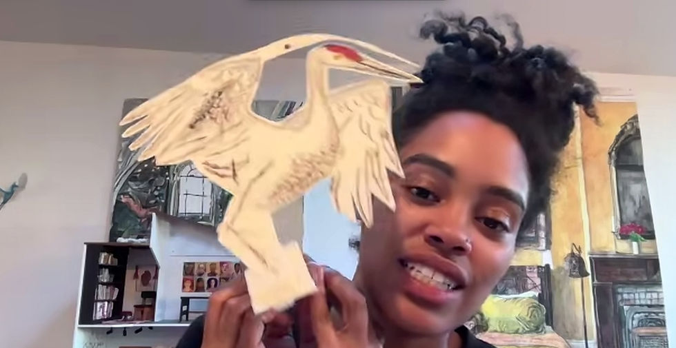
As well as examples of bird artworks from Ajani’s presentation.


John Singer Sargent, Studies of a Dead Bird, 1878, Jackson Pollock, Bird, 1938-41,
Constantin Brancusi, Bird in Space, 1941
Art materials were up to each artist, and all of us managed to make low-relief or full-on sculptures, many well photographed to highlight their three-dimensional attributes.
Ajani summarizes the work created and the highlights from critique:
“Pat described taking a walk recently by a body of water and noticing the geese. The geese went to cross the street and were holding up traffic. Pat made several geese sculptures with various dispositions based on this encounter. The base on which the sculptures are placed helps define the space and gives the work more dimension. Meridith says you can feel that Pat was looking at birds moving through space, and it is reflected in the work.

Meridith, who recently read Venus and Aphrodite by Bettany Hughes (review below), was inspired by Aphrodite, who is represented by doves and is also the patron saint of the city of Pompeii. Using the style of mosaic native to Pompeii, Meridith depicted a dove in flight.

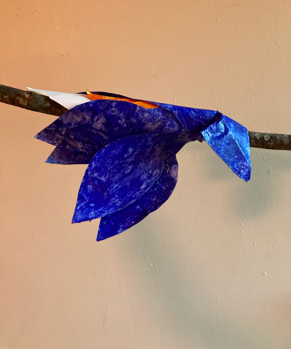
Sigrid created a multimedia sculpture of a bird resting its head on a branch. Sigrid chose the Eastern Bluebird and used repurposed leaves and branches from a school project to create its form and platform, using cut-out leaves to make the bird. Ajani was very interested in the correlation between plants and leaves, and birds and feathers.
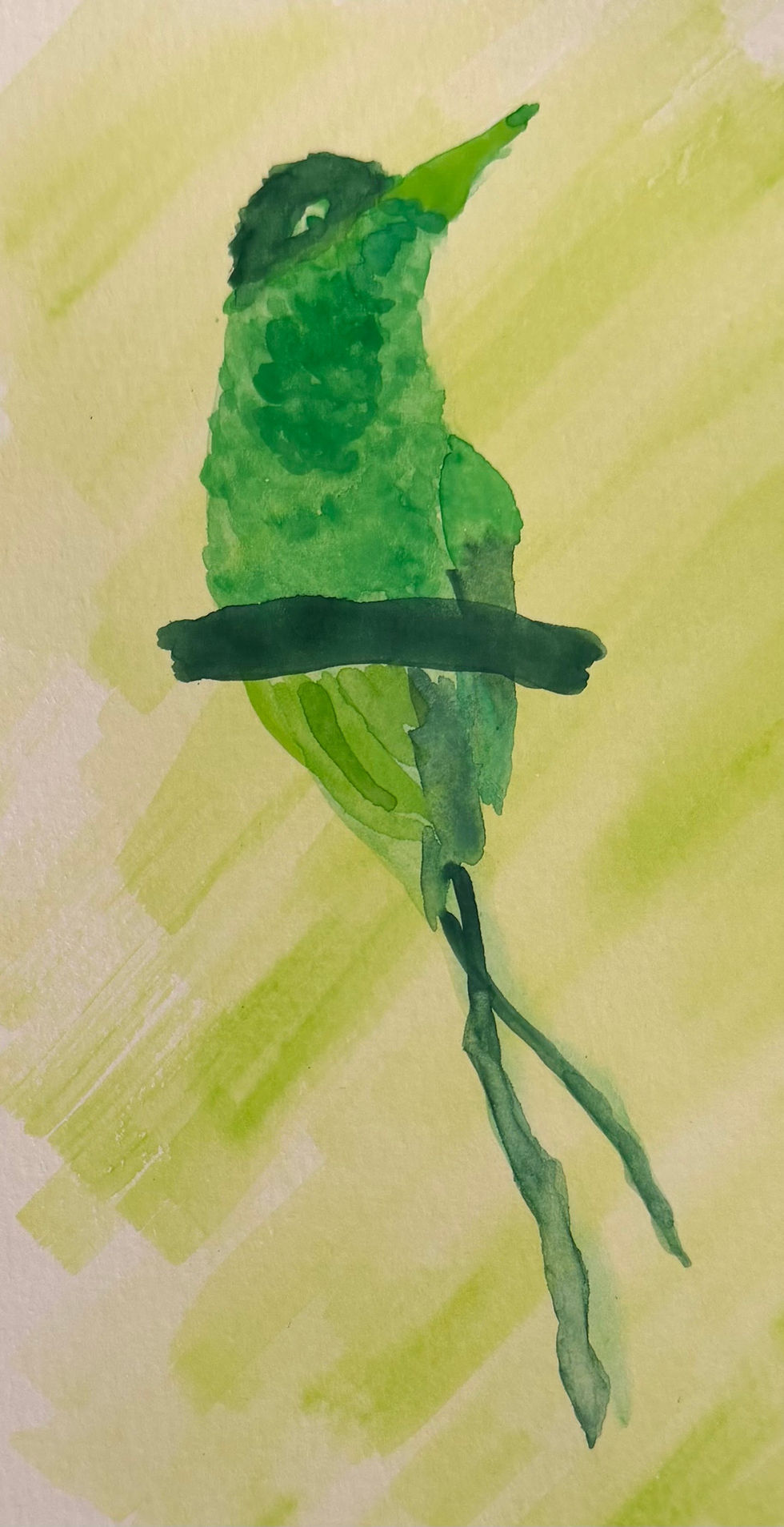
Aaron chose to render the Doctor Bird—the national bird of Jamaica. It is a type of hummingbird with unique and long tail feathers. The directional brushstrokes Aaron used to create the image invoke the feeling of foliage, the bird blending into the leaves of nearby plants.
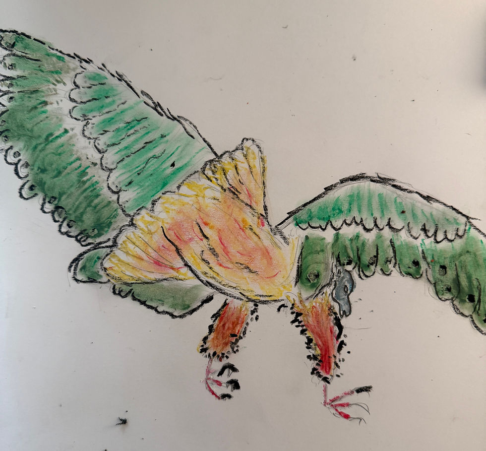
Sudan did two works. The first was a drawing of Batboy in red. The second shows a hawk or falcon with a pigeon in its beak—something Sudan saw while in the Financial District of New York. Adji said that Sudan’s piece reminded them of a chimera because of the distortion of the two birds’ heads. Sigrid said Sudan’s use of pastel makes it look like the birds are objects placed on the paper. The deep black creates shadows that appear almost velvet.

Marilyn reminisced about a hike she took at Pinnacles National Park, where she finally saw a California condor. This is the largest North American land bird, similar to turkey vultures but distinguished by the white on the front of its wings. Many of us were baffled as to what material she used upon first seeing the images of her work. She used construction paper to fabricate the bird and then displayed it amongst some purple orchids. The color and backlighting really made the piece pop, and the placement created an environment for it.
Pat compared Marilyn’s work to Matisse in the use of silhouette. Pat also said the scale of a condor makes everything around it appear larger than life because its scale informs the size of the background.

Adji’s sweet northern cardinal is a very expressive red bird. Resting upon a tree branch and photographed on top of their floral sheets, the piece has both weight and environment. Adji describes being woken up by their cat knocking on the window in an attempt to reach a cardinal sitting just outside. When Adji looks out the window, they see this bird looking back at them. The piece represents reflective morning moments, as well as the annoyance of being woken up by their pet first thing in the morning. Adji’s use of diluted oil paint and the blending of colors is thoughtful and painterly.

During critique, the expressiveness of the birds was compared. Pat was struck by the different techniques people used across a range of media, and how the backgrounds became part of the artwork. Pat also noted how we all chose specific birds that we have personal connections to.
Adji highlighted the depictions of stationary birds versus birds in flight, noting how each piece creates a sense of movement differently.
We also noticed the differences in the creation of feathers—drawn line, texture, painted Tyvek pieces, and pastel.”

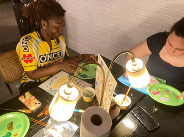
Tuesday in Advanced Studio in person at 180 Franklin Avenue AYB Artist Fatima Traore presented Passing Perspectives: Creating Still Life Through Motion, a collaborative drawing project!
Fatima writes: “This session inspired by the idea of migration. Participants began and finished their own artworks, while also contributing to others’ pieces through a series of timed prompts—bringing each work to life through shared input and evolving perspectives.

The exercise became a kind of “pass-and-paint” still life, guided by memory, imagination, and feeling rather than direct observation. Working with acrylic on paper, I opened the session by inviting everyone to create a color palette based on their mood or vibe.


Each artist began with an object of personal significance or a familiar still-life element—books, apples, vases, and more. From there, prompts encouraged participants to build on one another’s work while honoring what was already there. With each round, new elements were introduced: surfaces, fabrics, fruits or food, flowers, textures and patterns, backgrounds, and finally light and shadow.
The result was a collection of layered, collaborative pieces—each one carrying the touch of multiple hands. To close, participants exchanged artworks, making the experience even more meaningful: everyone left with a piece shaped by the entire group.”

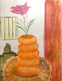


Collaborative paintings by AYB Artists Sebastian LeBossiere, Lilo Lewis, Georgia-Rae Lyken, Meridith McNeal, Chace Mondesir, Cheyenne Rivera, Shellorne Smith, Fatima Traore, and Molly Vince.
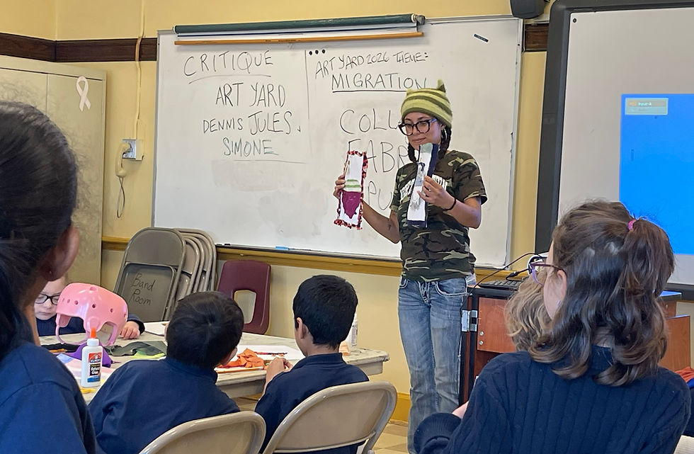
ART YARD Art Matters in the school enjoyed sessions with Evelyn Beliveau at PS17 and Jules Lorenzo at PS 6.
AYB Teaching Artist Evelyn Beliveau reports: “This week, our PS 17 team was Dennis, Simone, Chris, and me (Evelyn). Our Grade 4 class was away on a field trip, but we were busy preparing materials for the start of their next lesson cycle: papier-mâché sculptures of the NJ state bird, the goldfinch! Students will start by assembling an armature, then use papier-mâché, and lastly paint with acrylic.

In order for the class to hit the ground running next week, our team created the components for the armatures. We attached pairs of 1.5- and 2-inch Styrofoam spheres with toothpicks, traced and cut the shapes of wings, beaks, and tails out of cardboard, and used scissors to make slots in the Styrofoam to fit tabs on the cardboard pieces. It was painstaking work, which took up the class period when we would normally have our Grade 4 class as well as a bit of extra time after school. We tested out the assembly of a couple completed sets (with my sample piece for reference). All is ready for our 4th Graders!


We decided to give our Grade 7 class one more period to finish their linear perspective acrylic paintings. They made good use of the time, and many ended class with a beautiful completed painting (there will be one more makeup day at the end of the year for those who worked more slowly—also doing lovely work!). Two pairs of students finished early enough in the period to join Simone at the critique table, having thoughtful conversations about comparisons, contrasts, and compliments for each other’s work. Students depicted roads receding to the horizon at a variety of times of day—noon, sunset, and night, with one student depicting the aurora—and locations, from deserts to mountains to fantastical locales.


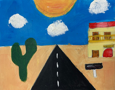


Linear Perspective Landscapes


Critique with Simone
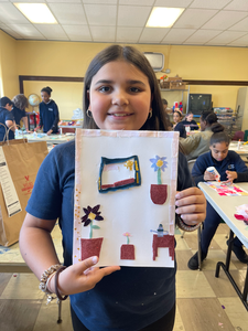
Grades 1 and 2 began a new lesson cycle this week. For this project, we took inspiration from AYB Artist Ed Rath, who was gracious enough to share images of his work with me for my presentation. Thinking of the Year of Migration, I focused on Ed’s depictions of city streets and vehicles, showing the paintings The Bravest People in the World, 36 x 48”, acrylic on canvas, 2024, The Machine Age, 16 x 32”, acrylic on canvas, 2017, Iconoclast, 46 x 60”, acrylic on canvas, 2018, and Crosswalk, 36 x 48”, acrylic on canvas, 2019.


Students were delighted with these pieces and eagerly pointed out details in the scenes, such as dogs and people, taxis and cars, bicycles and buses, and trash lying next to a trash can. They also noted the color schemes, with one student admiring the range of pinks and reds in Iconoclast.

Then, it was time to draw, starting with pencil on paper for this week. Each student began with a street and chose people, vehicles, and other details to add; some filled their streets with cars and their backgrounds with buildings, while others focused their attention on a park beside the street. Many included themselves and their friends as characters in their drawings or made up stories, such as a duck crossing a road. Our team was busy helping out with tricky-to-draw vehicles and offering encouragement. Students seemed very proud of their work and are excited to add color next time.


Chris and Evelyn encouraging students working on drawings
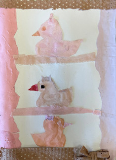
AYB Teaching Artist Jules Lorenzo recaps today's ART YARD Art Matters at PS 6: “We’ve reached the thrilling conclusion to our Home: Here, There, Everywhere lesson, where students at our Jersey City Partnership school PS 6 have been working on fabric collages. The student’s work depicted various items that can either be found in homes or are in relation to the idea of “home.” These works took inspiration from fabric sculptures by Do Ho Suh and multi-media collages by Judy Bowman (in that order below).


In Week 1 students were instructed to pick a prompt out of a cup and then create a sketch based off their selected item. After the initial sketches were complete, each class was encouraged to come up with a color palette that would translate from paper and pencil into fabric.
In Week 2 students began working solely on recreating their sketches as fabric collages.
For this final class cycle, I was assisted by Simone Awor and AYB Managing Director Dennis Buonagura.


Dennis, Jules and Simone!
We reviewed our recurring vocab words for this lesson, discussing what fabric is, what’s a collage, and what it means to repurpose something. Then we dived straight into our class work: Finish our collages!


For some students this meant adding in the last few details to their pieces, whether that be a few more books and trinkets for their bookshelf or a Venus fly trap to their plant pot. For other students, this looked like crafting their backgrounds as well as borders for their subjects.


We had two new students join this lesson and begin collaging at an astounding pace. There were also others that made not one but THREE additional fabric collages. Way to make the most of our class time PS 6!
One of the students who was working on a second collage piece took some time last weekend to really think about an item that reminds him of home. When he returned to class this week, he recreated one of his favorite Pokémon cards as a multi-media collage! He even brought the card in for reference.

Towards the end of our session we did a critique which entailed students taking turns comparing and contrasting their fellow classmates' works of art, as well as giving very sweet compliments to one another.

Other Art News
AYB Artist Sudan Green is working on an impressively sized ceramic vessel using coil techniques!

Herman Melville’s Moby Dick directed by Robert Wilson is in performance at BAM through May 3. AYB Artist Abriel (bob) Gardner reviews: “For a book that took me 8 months to read, Moby Dick the Opera adapted the story very well into a 2-hour show. (Surprisingly, those 2 hours flew by despite it being an opera in German about Moby Dick...)

The overall tone of the show was a lot less weird and more Broadway-esque than I expected. It felt reminiscent of a stripped-back version of Cabaret. The actors’ faces were painted white, and the costumes had a 1940s feel that were all toned to a greyscale.
The performers were incredible storytellers, singers, movers, and overall showmen. Although there wasn’t so much dance/choreography, the movement direction was full, clever, and embodied. The set design was ominous, minimal, and a tad brutal. I really enjoyed the light design, which used a lot of simple spotlights and long LED strips of light illuminating the stage.
My least favorite aspect of the show was the music itself, just because it was not really my style. It had a very pop-rock, Broadway belty vibe with hints of classical opera sprinkled in. I honestly was expecting whale sounds… so.
The part I was most excited about was that they included my favorite chapter: “The Whiteness of the Whale.” When I read that chapter, I had a total vision of a stage adaptation of it, and although they didn’t do what I would’ve done, I thought they interpreted it well.

I was definitely expecting something a little bit more cutting-edge and strange, but I think overall this was a great production/adaptation of such an epic and classic tale, which is very hard to do in my opinion. Overall, I give it an 8.5. Yayyy Moby Dick!”

What We Are Reading
Venus and Aphrodite: History of a Goddess by Bettany Hughes (Basic Books, 2020) is a fast and provocative read. I (Meridith) really enjoyed this consideration of Aphrodite—from her deep history to present-day references—and in fact, it even inspired work I created in Ajani’s Advanced Studio Session on Monday.
Through ancient art, evocative myth, archaeological discoveries, and philosophical exploration, Hughes shows why this immortal goddess endures into the twenty-first century, and what her journey reveals about what matters to us as humans. Charting her origins in powerful ancient deities, the book makes clear that Venus is far more complex than she first appears. Beginning in Cyprus, her mythical birthplace, Hughes traces connections between Aphrodite and earlier figures like Ishtar, Inanna, and Astarte, revealing a lineage that spans fertility, war, desire, and power.

What emerges is a rich, layered portrait that goes far beyond the familiar associations of beauty and romance. Instead, Hughes presents a figure that embodies human desire in all its transformative force—how it shapes who we are and how we move through the world.
I love a well-crafted artist biography. Alice Baber: An Artist’s Triumph Over Tragedy by Gail Levin (Pegasus Books, 2026) absolutely delivers.

Levin, known for her work on Edward Hopper, Lee Krasner, and Judy Chicago, brings her signature depth and clarity to the life of Alice Baber—a painter of color and light whose legacy has too often been overlooked.

Levin—whose books on Edward Hopper and Lee Krasner I enjoyed—offers a deeply researched look at Alice Baber’s life. From her early years and education to a difficult, manipulative marriage, the book doesn’t shy away from complexity. At the same time, it beautifully illuminates Baber’s philosophical ideas and her artistic process, drawing on her own words to describe how she created her luminous, color-filled abstractions - “colored wind and rain” are luminous, airy compositions filled with movement, radiance, and light.

Baber was widely respected in her lifetime and deeply mourned by a remarkable circle of peers in the NYC art and feminist communities. It’s exciting to see her work gaining renewed attention, and this book feels like an important part of that rediscovery. I’ll definitely be seeking out her paintings in person.
Art Opportunities
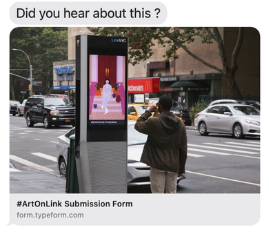
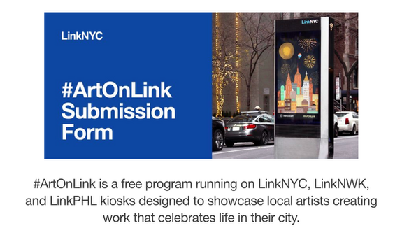
AYB Artist Travis Pereira alerts us (open to artists in NYC, Philadelphia and Newark) to an open call to have work featured in #ArtOnLink!


MARK YOUR CALENDARS!!!!

Happy May Day!
🌸🐦⬛🌸


Comments