
Putting it together, bit by bit
- frida@artyardbklyn.org

- Apr 15, 2022
- 8 min read
Updated: Apr 18, 2022
"Having just a vision's no solution
Everything depends on execution.
The art of making art,
is putting it together, bit by bit"
Stephen Sondheim, 1983, "Sunday In The Park With George"
Managing Director Dennis Buonagura reports: “At our partnership school in Jersey City, PS 6, teaching artist Evelyn Beliveau worked with students 'bit by bit' to complete their pieces made during this 3 week cycle.
Evelyn brought a musical component to her lessons which helped students to concentrate while making art.
Each students' work was completed quite successfully. In cases where their grid sections had lots of detail, others volunteered to help classmates, working in teams. They worked diligently with Evelyn to connect all the grid sections and put them together for their large scale finished works.
Mr. Pasuco's class viewed images of Georgia O'Keeffe. They saw one of the many famous Alfred Steiglitz's photos of O'Keeffe from 1918 - and painter Elizabeth Peyton's 2006 version of that same photograph. AND they also saw one of Peyton's works from a private collection (can you guess WHOSE private collection??). Several students wanted to continue in this fashion and create their own versions of Stieglitz's photo. They traced O'Keeffe's face from the smart board while others asked for prints to take home with them to work on. PS 6 students joining the ranks of O'Keeffe, Stieglitz, and Peyton. This group listened to The Nields's song “Georgia O” while working.


Ms. Unterman and Ms. Colonna's class listened to Don McLean 1970's hit "Vincent", performed by Jane Olivor. Some closed their eyes and concentrated on the lyrics carefully and we discussed what the song means - particularly the lines "ragged men in ragged clothes", "paint your palette blue and gray" and "swirling clouds in violet haze". At one point, Principal Apruzzese stopped by this Van Gogh class and remarked how serene and peaceful the atmosphere of the class was while the music was playing.


Evelyn did some research and found that Stuart Davis' favorite music was jazz by Earl "Fatha" Hines - which he probably listened to while making art. PS 6 students did exactly the same while finishing up their Davis' pieces.


A busy and successful day - putting it together, bit by bit."
Nayarit Tineo presented her first class for ART YARD Advanced Studio on Zoom titled Gaia: Personifying the Earth. Nayarit prepared a wonderful PowerPoint complete with moving images and well researched artists to serve as inspiration. We then created artwork in the materials of our choice in which we personified the earth based on current events.
Nayarit tells us: “I wanted to focus on the personification of Gaia, considered to be a goddess in Greek mythology to Mother Nature during the Middle Ages. This year is all about healing, to promote recovery of any form it is required to acknowledge the problems, the pain, and the issues at hand. I asked participating artists to reflect on current events happening on earth that is affecting multiple environments and people’s livelihood with the main question what is the earth feeling?

When approaching this lesson, I was interested in how we frame the earth as Mother Nature, setting the earth to be gendered. As we proceed with the lesson, I was amazed how we did not question such gendered assumptions of the earth. The students pushed the lesson further in a deeper understanding beyond just personification but the symbolism that can be present with the earth. My presentation included clips from the movie Moana and work by artist Anna Sorokina for inspiration.

I really enjoyed the range work created in the session from Meridith with her symbolism of the fragility of the earth to Marilyn’s fire highlighted the importance of forest fires in current regions, and Ed’s piece of reintroducing wolves in their current habitat showed the delicacy that the earth has.


Zeke tackled the important - what are we doing about? - aspect of the questions.

Jane and Delphine's pieces took a humorous take to the matter, while having a rich irony that makes you rethink how we are treating earth’s issues.


Alison’s piece made me very emotional as she said, “the earth would be ashamed of us, in the ways we are treating it,” which is exactly what I wanted the class to take away from the lesson as we reflect on healing ourselves and our planet.”

Wouldn't it be wonderful to see these pieces as a public awareness campaign? Perhaps on the side of a bus stop or on the train?!

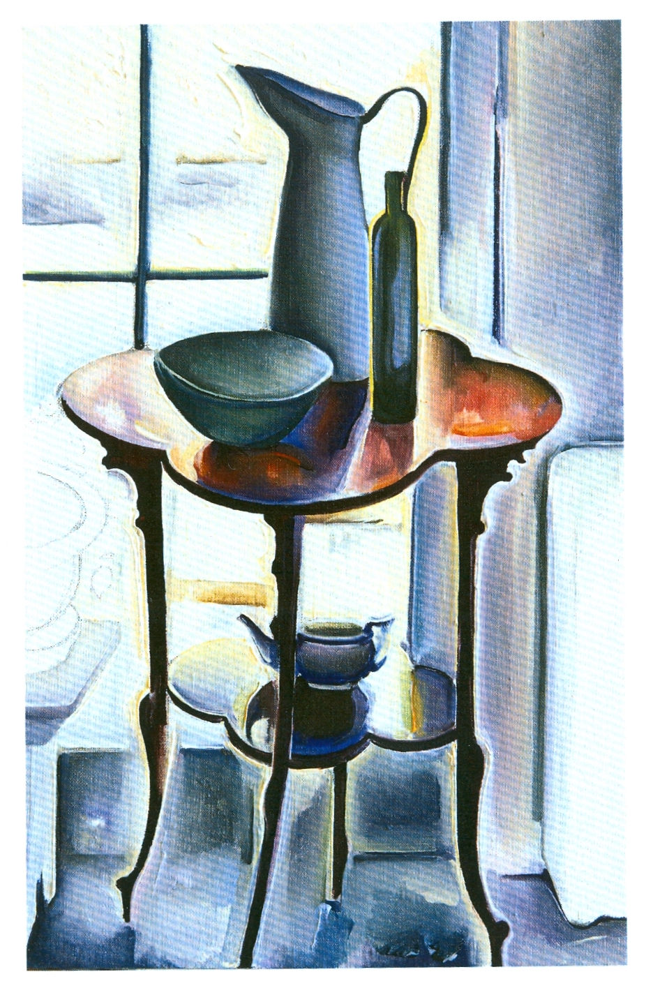
Building on last week’s lesson on local color, this week ART YARD Advanced Studio working with Teaching Artist Ed Rath re-composed our still life images using only gray, black, and white.
Ed summarizes: “We discussed how each color positions itself on the picture plane per Hans Hoffman’s push-pull theory. We looked at four still life paintings by Margaret Sparrow, a contemporary painter who lives and works in Vermont. We observed how Margaret carefully breaks the picture plane, using geometric assemblies and well observed local color to reveal the beauty of natural light as it illuminates her lush set-ups of fruits and dishes.
Next, we looked at four drawings by Georges Seurat. Using Conte crayon on rough paper, Seurat’s glowing drawings appear to be made of pure light. The rough paper creates a pixilated effect not unlike his colorful pointillist paintings.

At critique, several participants said they found the exercise a bit intimidating, but we all forged ahead, and the results were impressive.
Alison’s beautiful drawing uses line with gray shading to create an intimate close-up of her shallow-space still life, viewed from above.

Karla depicted her carefully placed still life objects using ellipses, arches, rectangles, and straight lines to create a deep space bathed in clear light.
Evelyn adds: “I was struck by the flickering of sinuous dark shapes through Karla's piece, which were clearly the result of close observation and simultaneously gave the piece a strong abstract quality."

Marilyn used a similar arrangement but clustered the objects on the right half of the page. Her delicate line work in the background creates a pleasing, airy feeling around the objects.
Evelyn pipes in: "Marilyn's approach to shading was very successful, with stronger contrast in objects in the foreground and more delicate contour lines on the objects further back. I also found the gentle clustering of objects in her still life lent itself to personification, as if they were uncertain guests at the edge of a room."

By controlling the pressure of her drawing tool, Jane achieved an over-all feeling of natural light and shadow.

And so, we can see that Still Life Imagery does not have to feel dark and dead.
In this iteration of Tools of the Trade Ed tried to emulate Seurat, with limited success. Seurat, who masterfully turns contour lines into gradations of dark and light shading, somehow managed to do his work with nary a smudge. Ed finds Conte crayon to be a very challenging material.

Evelyn's comment has me including the first two of Ed's Tools of the trade. "I loved seeing a third rendition of Ed's composition of construction tools--it was very different both from the contour line and the color version we saw last time. The glowing lights and darks enmeshed in a rich tapestry, and succeeded in de-emphasizing the centrality of the circular form that Ed had pointed out to us last week."


Ed Rath, Tools of the Trade I & II
Meridith had great control of the Ebony pencil on rough watercolor paper, maintaining the surface tension of the picture plane with her well nuanced shading.

Nayarit’s fanciful composition combines the iconic Dome of the Rock with an intimate still life of everyday objects. The scale contrast calls us to ponder the emotional power of small experiences compared with that of the monumental,

Vera created a digital still life of objects found in her kitchen. The different textures make her grays come to life – in fact, you can almost taste the different fruits. This piece illustrates well how gray, black, and white, can effectively represent color in all its glory.

Evelyn’s well observed drawing captures directional light with its resulting shadows. The textured paper make the drawing glow. On the vase Evelyn delicately laid the shadows down without the use of a layout line, once again demonstrating her confident hand and singular vision. At critique, Meridith compared her piece to Giorgio Morandi’s work.


Madison, her face reflected in a small make-mirror, offered a quixotic, allegorical still life incorporating a comb, glasses, and a soda can. Combined with the self-portrait, her piece leaves us much to reflect on.

Evelyn made some great comparison: "Meridith and Vee's pieces both sparked art-historical connections--Meridith's use of a strong paper texture to break up her marks reminded me of the Seurat (below left) images we looked at in the beginning of the class, and Vee's stark graphic marks on white reminded me of the strong lights and shadows in Wayne Thiebaud's (below right) cake paintings."


Evelyn "found the lesson very centering, as paring down the variables to just black and white opened up an opportunity to hone in on delicate nuances of light and dark. Working on the rough texture of a canvas pad, I enjoyed letting individual marks dissolve--drawing light rather than drawing form--which also reminded me of another Ed lesson (from late 2019 or early 2020) in which we used short strokes of Sumi ink to emphasize the effects of light over solid forms.”
This week at ART YARD Art Matters at BNS, we finished our two-week lesson inspired by "Your flowers are so lovely they have made me well again," the public installation of flower paintings by Art Yard teaching artists.

Teaching Artist Evelyn Beliveau explains: “Last week, students used colored pencils with a focus on gesture drawing, working large and trying to imitate the energy or motion in flowers they observed from life. This week, we dove into acrylic paints. I was impressed by students' energetic and thorough brushwork as they filled their sheets with color. Students zoomed in on the flowers, zoomed out to include tables and surroundings, or added imaginative elements to the scenes. Some students depicted leafy fronds with an ecstatic spray of color; some included heavily worked backgrounds and others used a limited palette or reserved very pale tints for the negative space around bold-colored petals.


We also had a conversation about why we have guidelines and goals for the subject matter and techniques of our lessons. First, students are pushed to try new techniques and tackle different subject matter than they otherwise might, learning skills and art vocabulary along the way. Second, when we all work on the same theme (even though each student's interpretation is unique!) we're able to draw meaningful connections between each other’s pieces at the end, and take away more from the lesson from having seen how another student approached the same project. We explored this during critique, in which students pointed out comparisons and contrasts, and everyone gave at least one compliment.


There is nothing like looking at art in person. Even the best photographs of a piece play second fiddle to the real thing. Last week I went to Cecile Chong’s gorgeous solo exhibition LORE on view at KATES-FERRI PROJECTS, 561 Grand Street, Manhattan through May 7, 2022. While this work is stunning in reproduction, as evidenced by these photos from the opening:


Cecile Chong, Pecking Order (in Blue), Ryan and Cecile at the opening, & Cecile Chong, Parenting Tips (in Blue)
Looking at the real thing, seeing the texture of the bees wax in Cecile'e encaustics with its embedded pigment and delicately etched hand drawn tree limbs is a next level experience. One can even smell the distinct sweet smell of the melted wax.
Hope you have a chance to see the exhibition!
What art will you see in person this weekend?!
💖


Comments