
Catching Feelings
- frida@artyardbklyn.org

- Feb 13
- 12 min read
It’s been quite a week at AYB! In our ART YARD Art Matters in the Schools programs, the new cycles are in full swing—students diving deeper, building skills, and bringing art projects to the next level of completion.
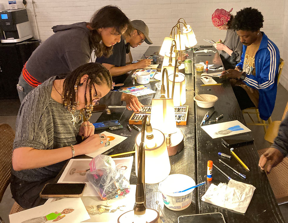
In Advanced Studio on Zoom, we explored Love in Contagion, tracing how emotion, energy, and movement ripple outward from person to person. Meanwhile, in Advanced Studio in person, we celebrated Valentine’s Day with Ruth Asawa–inspired watercolor explorations.
We also had a special full-circle moment: Leni cashed in her raffle prize from our Movers and Shakers benefit—an unforgettable risotto dinner experience. And there’s some exciting Other Art News brewing… read on!
This week in Advanced Studio on Zoom, AYB Artist Fatima Traore led a session titled “Catching Feelings: Love in Motion.” Together, we explored migration beyond physical movement—considering how emotions, gestures, and energy travel from person to person. Through discussion and creative exploration, students reflected on how feelings circulate, connect us, and shape shared experience. It was a powerful reminder that movement isn’t only about geography—it’s about exchange.

Fatima recounts: “This explored migration through the lens of energy and love in motion. I invited participants to consider questions such as: Have you ever ‘caught’ someone else’s mood? Where does energy begin? How does it move across space? How does it connect people? Inspired by the contagious spread of laughter, joy, and smiles—especially fitting during Valentine’s season—I encouraged artists to reflect on the joyful forces we have the power to share.
Drawing inspiration from artists Keith Haring and El Anatsui, whose work embodies movement, rhythm, and emotional resonance, I grounded the session in visual examples of energy made visible. I also referenced the broader idea of how one person can spark a movement through hope and love, citing Barack Obama’s message of hope and Bad Bunny’s recent Super Bowl performance highlighting the sentiment, ‘The only thing more powerful than hate is love.’


The critique process added a thoughtful twist: before each artist explained their work, fellow participants first shared the emotions, feelings, and energies they experienced upon viewing the piece. Time and again, the group’s interpretations aligned closely with the artist’s intentions, affirming the power of visual storytelling to communicate energy across space.
Artists explored the theme in deeply personal and varied ways:
Nayarit created a digital collage capturing awe and childlike wonder.

Cheyanne depicted the chemistry between two people immersed in their own world, accented by a heart-shaped abstract motif surrounding them.

Adji explored energy as something both moving and protected amid surrounding chaos, using contrasting paint treatments and bold color shifts.

Rashidah illustrated the migration of sound through the spirit of West African music—drumming and dance traveling through and filling the body.

Aaron rendered a visceral moment between two figures reaching into one another’s chest, using minimal contour lines to heighten emotional intensity.

Karla composed a dynamic collage of circles and implied lines, reflecting on how energy builds—one action leading to another—until it bursts outward.

Marilyn shared a joyful collage of laughter spreading from person to person, complete with playful ‘ha ha’ and ‘tee hee’ text bubbles.

Flow presented a symbolic scene of ghostly figures drawing water from a well to fill their cups—some fulfilled, others depleted—while a laughing figure loomed above, suggesting the fragile balance of emotional energy.

Meridith offered a tender portrait of Ajani and Lola sharing a warm embrace in her home, radiating comfort and connection.

I (Fatima) concluded with an illustration of a box of chocolates, reimagined as emoji-shaped treats, symbolizing the exchange and transfer of love.

Overall, ‘Catching Feelings’ beautifully captured the ways energy migrates—through bodies, relationships, communities, and art itself—reminding us that love, joy, and hope are powerful forces capable of movement and transformation.”
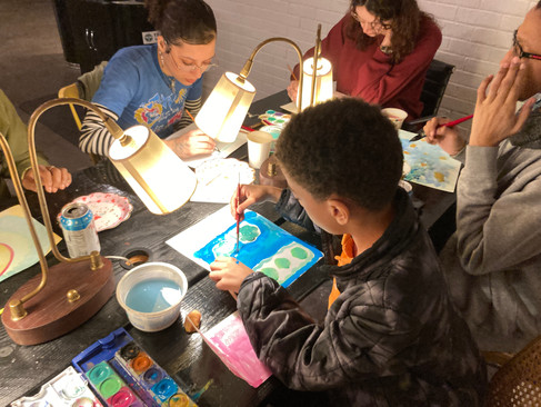
Advanced Studio in person at 180 Franklin Ave. in Brooklyn, AYB Artist Mia Lew, back in Brooklyn after her winter session at RISD, introduced students to the work—particularly the watercolors—of Ruth Asawa. Inspired by Asawa’s delicate, gorgeously colored forms, students created their own watercolor paintings. We paired our artmaking with a Valentine’s Day celebration ♥️—a perfect blend of art & love.

Mia tells us all about the lesson: “On Tuesday I taught my second class at Art Yard on creating watercolors inspired by Ruth Asawa. I was a little bit nervous as I’m still pretty new to this, but I was excited to go back to ART YARD BKLYN as I’m currently studying at RISD and have only been to AYB once since Summer Session. I really treasure the community and diversity of this magical place, so it was truly very nice to come back when I was between semesters.

A few months ago, I had to bring a book on an artist from the library to my drawing class, and I asked Meridith if there were any books she would recommend. One of the books she suggested was Through Line by Ruth Asawa, and I created two drawings in response to it. During this time, Asawa’s retrospective at MoMA had recently opened, and over winter break I went to see it. I was truly inspired by her. Asawa was such a generous, community-oriented person, and you can really feel it through her work. Additionally, I adored seeing an artist who maintained such a fantastic interdisciplinary practice. The only point in her life when Asawa worked in one medium was when she had a residency at the Tamarind Lithography Workshop in Los Angeles. I continue to be in awe of her work across mediums, and as someone who had to declare my major two weeks ago in a single discipline, Asawa’s practice was something I looked to. Ultimately, looking at her work and how she knit wire, for example, made me feel more comfortable declaring my major as textiles.


Ruth Asawa Through Line book cover & sculptures installed at MoMA


Ruth Asawa, Untitled (Paul Lanier on Patterned Blanket), 1961, and Mia Lew, Drawing After Ruth Asawa
When I decided to teach again at AYB, I knew I wanted my lesson to be on Ruth Asawa. As it is the year of migration, this felt like a choice that made a lot of sense. Asawa was born in California to Japanese immigrants and, in her teens, her family was separated and sent to different internment camps due to isolationist policies for Japanese Americans mandated by the U.S. government during WWII. After being interned in California and Arkansas, Asawa lived in Milwaukee, Wisconsin; Black Mountain, North Carolina; and San Francisco, California.

As I stated earlier, Asawa worked across many different mediums and, while she is primarily known as a sculptor, she created a lot of works on paper, particularly watercolors. For this lesson, I shared images of Asawa’s body of work but paid special attention to her works on paper. I was particularly interested in hearing different thoughts and opinions on Asawa’s exploration of nature through both representational and abstract work. I have an irrational fear of teaching product art, probably due to research I did on art and early childhood when I was making kindergarten art lessons a couple of years ago, so the prompt was pretty loose: Create a watercolor inspired by an aspect of Asawa’s work.
Per usual, everyone took this lesson in different wonderful directions.


Jules, who put on a wonderful playlist, created a lovely image of her sister’s reflection in a dresser. The dresser she painted reads as delicate yet structured, and Meridith, who is currently creating a lot of miniature furniture, was particularly impressed with the way this image was rendered.

Fisola created an incredible spiral of smooth, soft, slightly cool tones that is completely mesmerizing to look at. It feels like it could lead one’s eyes to some serene place. I also really enjoy the feeling of water in the brushstrokes she created.

Flow painted what looks to be a building adorned with a bright red door. His mark-making is particularly impressive as he achieved a great deal of detail in this work.

JP, much like Flow, also created a piece with a door at its center. He used a vibrant color palette and a lot of stripes, similar to Fisola. He cited Mario Kart as his inspiration, and this playful spirit can definitely be felt through this work.

Favor, JP’s sister, painted a patterned work. I really enjoy the color palette she built, and it feels very spring-like. The sense she created feels like it is capturing a lot of movement and refreshing nature through abstraction in a very Ruth Asawa way.

Cheyanne’s painting reminds me a lot of the plant motifs in Ruth Asawa’s work. I feel like I can see the structures of the plants through it. The colors she used feel like a spring day, much like Favor’s, and reminded Margaret of Adrianne Lenker’s album cover for songs.”


Cheyenne Rivera, Watercolor inspired by Ruth Asawa, and Adrianne Lenker’s album cover painting by Diane Lee.
Margaret said that she found a lot of relief in creating a painting about her day as she had a cat dissection for nursing school. The result is a dynamic image referencing anatomy and bodily systems that can read both abstractly and figuratively.

Sebastian’s use of shape in his work feels very Ruth Asawa to me. Margaret continued to shared eloquent words when she referred to Sebastian’s painting as a “painting of abundance.” I don’t think I could have put that any better myself.

Fatima created a painting inspired by Ruth Asawa’s castings of the people who busted her home. She put her own spin on this but creating heads attached to balloons. An image which may sound scary but is rather dream like a reminiscent of Ajani’s long necked figures. Jules made a fantastic comparison when she says that this artwork is very similar to a horror manga called The Hanging Balloons.


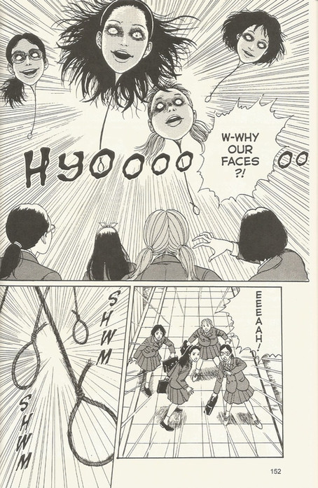
Fatima Traore, Watercolor inspired by Ruth Asawa, and The Hanging Balloons
Kevin challenged himself to not use an outline in painting. The result is a calming, mark making led I eave of blue flowers. JP put it best when he said Kevin “Ate and left no crumbs,” creating an uproar of laughter.

Abriel (bob), who had work and a long commute, amazed everyone when she got so far on her painting in six minutes. Her use of color and embracing the medium of watercolor is particularly evocative. I really enjoy the laying she achieved in this piece.


Abriel (bob) Gardner, Watercolor inspired by Ruth Asawa in process and complete
Lastly I (Mia) made an abstract image, using a lot of soft warm colors and browns. This piece was very intuitive but, inspired by Asawa, I tried to reference nature.
We also celebrated Valentines Day, and Dylan and Delanny made many Ruth Asawa inspired Valentines!


I really enjoyed teaching this lesson and had a lovely time being back at ART YARD. Thank you all for having me, I learn so much everything I’m here and really treasure this fantastic community. I’m so grateful to have found this fantastic place through a video on the internet, thank you Liv for that one :).”
Evelyn Beliveau reports on ART YARD Art Matters at PS 17: “This week, we wrapped up our introductory lesson cycle at PS 17, a two-session project called Names in Motion in which students created folded name cards that will stand on their tables for the rest of the year. Dennis, Simone, and I (Evelyn) met with each of our classes (Grades 4, 7, 1, and 2). Though a surprise half-day shortened our work time, many students finished their pieces and others made good progress. As we continue into future lesson cycles, students who didn't finish their name cards will have a chance to keep working on them when possible.

Each student was reunited with their work in progress from last week. We’d started the lesson cycle by learning about lettering styles and techniques for creating bubble letters, and we viewed the work of artist Sanou Oumar to discuss how patterns can make an artwork seem to move.

It was up to each student to decide how to render their name and fill the background of their name card with dazzling patterns. Students in Grades 4 and 7 had made thumbnail sketches and started to draw the pencil outlines for their final artworks last week, while many students in Grades 1 and 2 had progressed to the stage of shading with colored pencils.


Evelyn, Simone and students at work
This week, we discussed color contrast, using a color wheel and a few examples to show how opposite or complementary colors pop. We encouraged students to choose one color for the lettering and a few contrasting colors for the patterns—for example, a name colored in orange would be paired with patterns in blues, greens, and purples. I also modeled shading techniques, showing how layers of slow, careful hatch marks can efficiently fill in all the white bits in a shape. We circled around, helping out students with lettering and color choices. Those who finished proudly showed off their work, many opting to pose for Dennis’s camera.


We’re off to a great start at this school, and we’re looking forward to using these name cards to continue memorizing our students’ names as we begin our next round of lesson cycles.”
Dennis recaps today’s exciting day of ART YARD Art Matters at PS 6: “At our partnership school, PS 6, In Jersey City, Teaching Artist Travic Cinco finalized his lesson on Tenement Housing In Miniature Scale with 5th, 4th, and 1st grade classes. Today's lesson had a sub-theme of COLLABORATION (pertinent to the artists who inspired the lesson, Isabel and Alfredo Aquilizan) which intrigued the students upon their arrival (seeing the word on the board).

"The art of making art.." (from Stephen Sondheim's "Sunday In The Park With George") sometimes (in school programming) requires step-by-step instructions - which need to fit into our one hour time limit. Sometimes I arrive to the school wondering how we'll get things done in such a short period of time. But - SUCCESS today (as always at PS 6)!


We were assisted by Simone Awor - which was a gigantic help. We set up the room by placing the projects on the entry table and instructed students to find their piece and then their seat. We'd prepared plates of very watered-down water color paint (from tubes) and placed two colors on each table. Travis demonstrated the painting process - a bit like house painting but only adding faint and slightly translucent wash. The paint dried quickly on the cardboard and students moved forward with final, last minute touches to their structures.


Here's where collaboration falls into place. Travis and Simone had students work in teams (however many were at their table) to agree upon (collaboratively!) connecting their works. They could be stacked, side-by-side, or cornered, or .... however. Once one table had a collaborative piece, the students collaborated with those of the next table ... and so on.


Critiques took place at the end of each class's joint efforts with lots of compliments and smiles. Two fifth graders added these statements during critique: "Our creation of these houses exceeds the limits of reality" (ummmm .... yes ... a fifth grader really said that!) and "I love them because they are very diverse, even in color".
At our Movers and Shakers Benefit in November, we held a raffle to raise funds in support of AYB’s programs. While most prizes were stunning original artworks, one rogue “experience” prize was: a homemade Risotto Dinner prepared by Ajani, Abriel (bob), and Meridith.
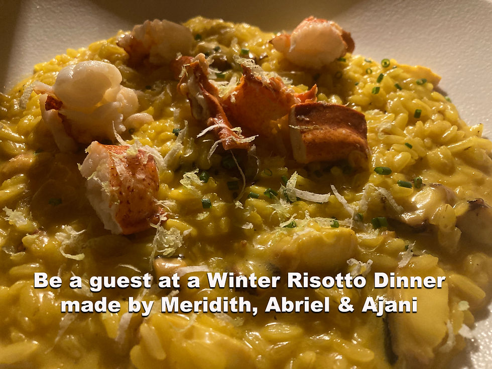
The lucky winner? Leni!
We gathered for a delicious evening featuring non-dairy black risotto with saffron shrimp, roasted asparagus and pearl onions, and non-alcoholic sangria. It was memorable in more ways than one—just a few bites into the rice course, the cellar pipes burst! An eventful twist to an already lively evening.


Leni tucks into the feast, and Bob dons Mike's galoshes to sweep water out of the house to drain.
As the manifestation of a raffle prize, this dinner was a reminder of the generosity and creativity that fuel AYB. Thank you to everyone who supported the benefit and continues to help sustain our programs. 💕 💕 💕 💕
Other Art News
I (Meridith) am pleased to have work included in After the Leaves Have Gone a visual love-letter to the season. Inspirational art that embraces the crisp optimism of winter’s pared-back beauty – its sparks of frosty joy, its chilly energy, and its relentless march towards rebirth and renewal. The exhibition is presented by the Cultural Center of Cape Cod in South Yarmouth, MA.

OPENING SOON!!!!!
Peer More Closely: A Meridith McNeal Retrospective is getting installed now at The Museum of Miniature Houses in Carmel, Indiana!


Comments